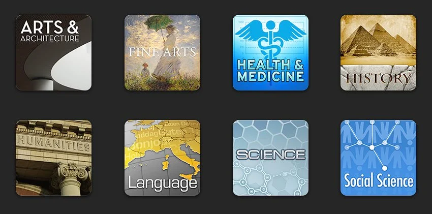
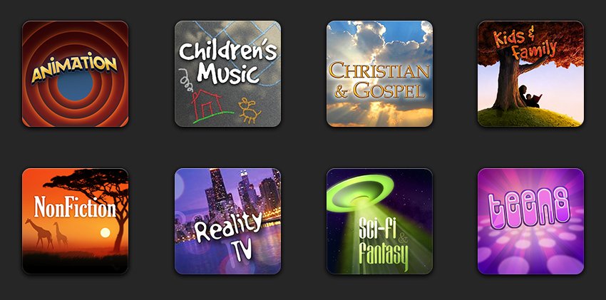
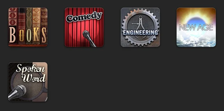
Artwork for various genres in iTunes. Some were for audiobooks, some were for other media.
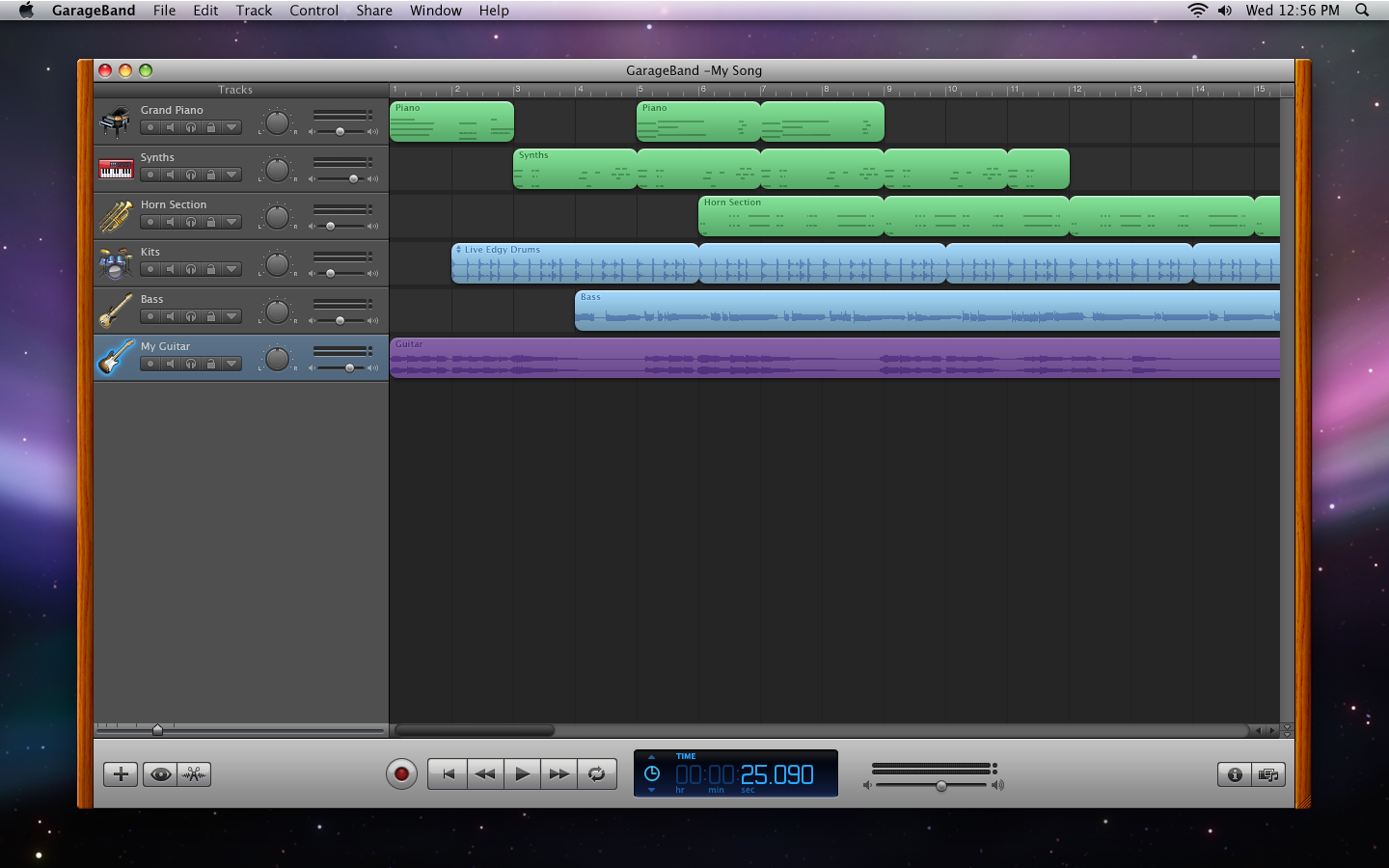
Much of my time on the iLife team was spent working on GarageBand. I worked with some very talented designers who were based in Germany, as part of the original eMagic team.
I was the sole designer from California on the team, and I represented Apple’s design interests and aesthetic, but the German designers were endlessly patient and fantastic collaborators.
Version 5.
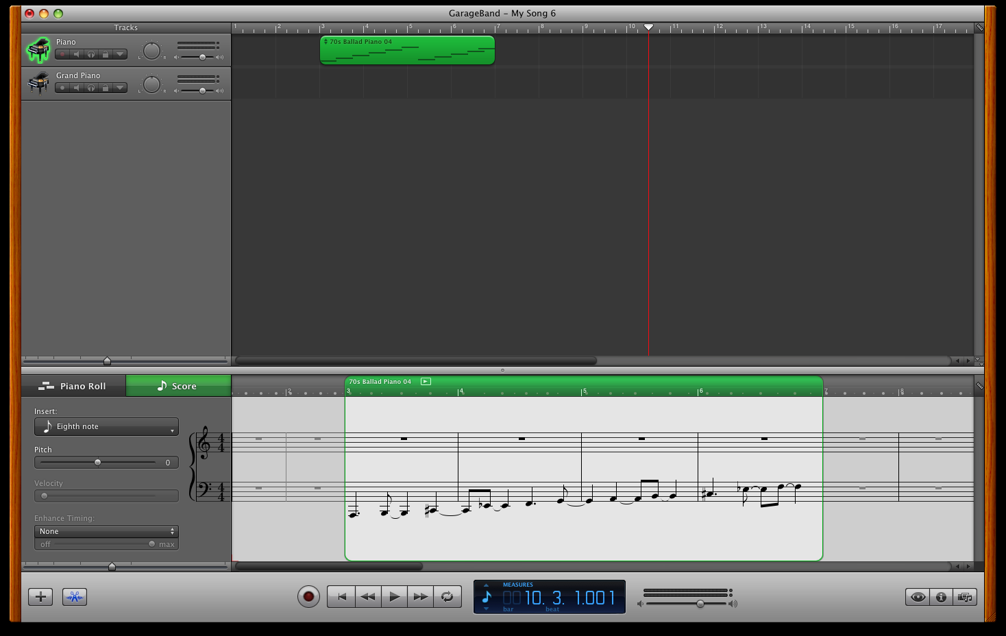
Notation editor.
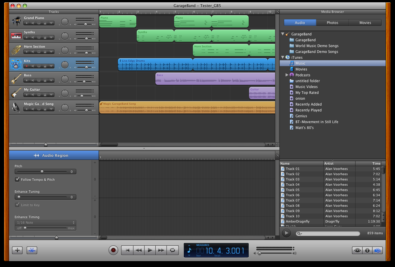
Media Browser.
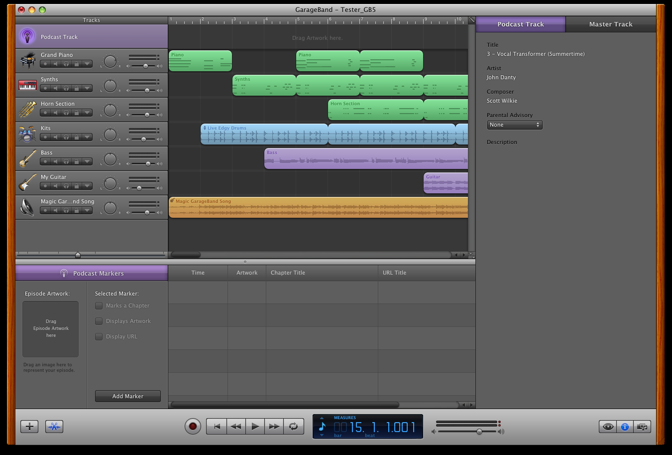
Podcast editor.
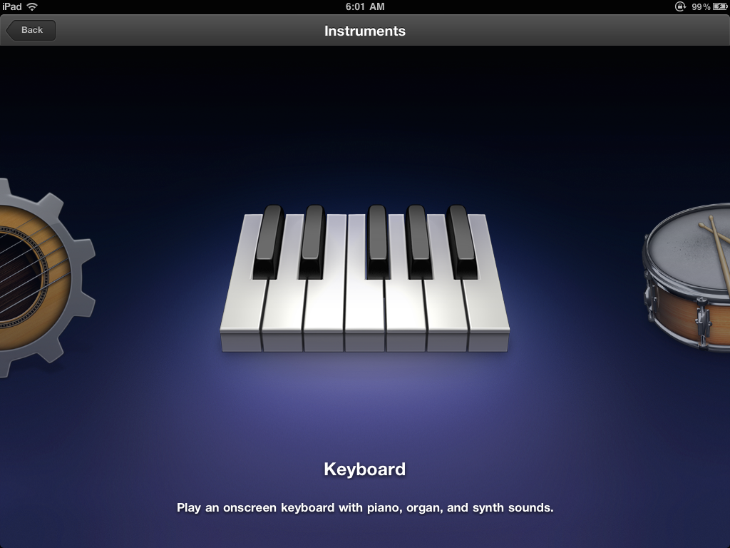
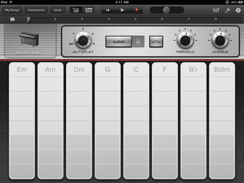
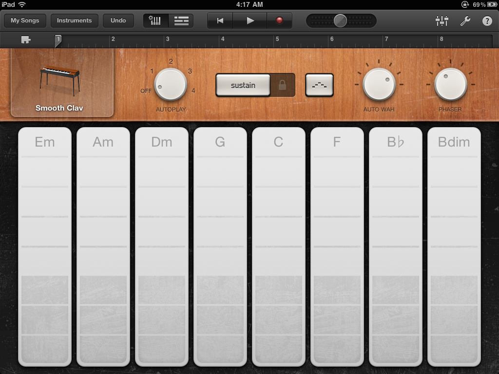
The Instrument Carousel. First thing users see when launching GarageBand on the iPad.
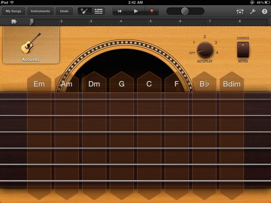
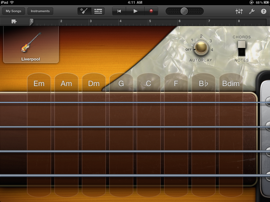
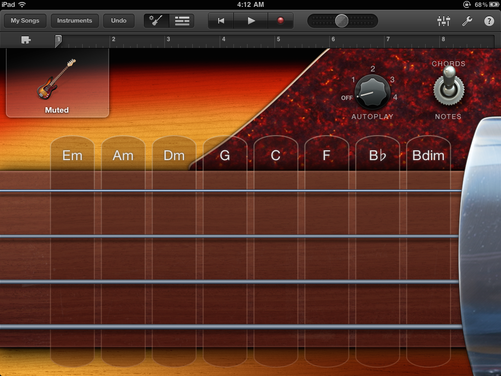
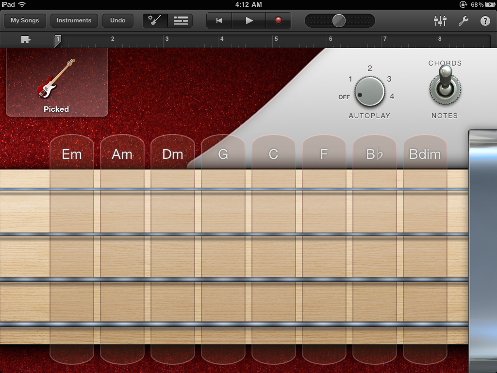
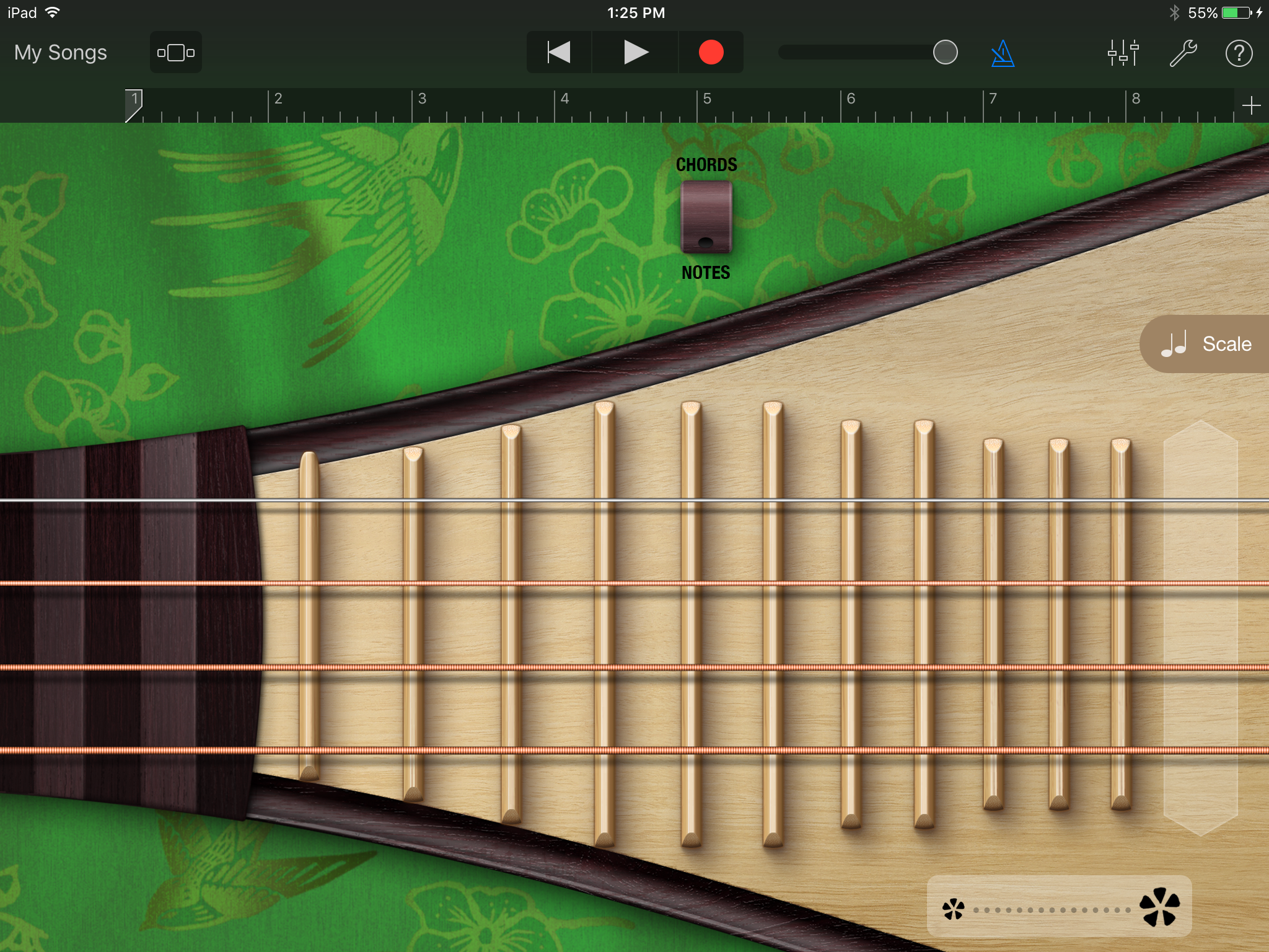
Smart Guitar, Chord view.
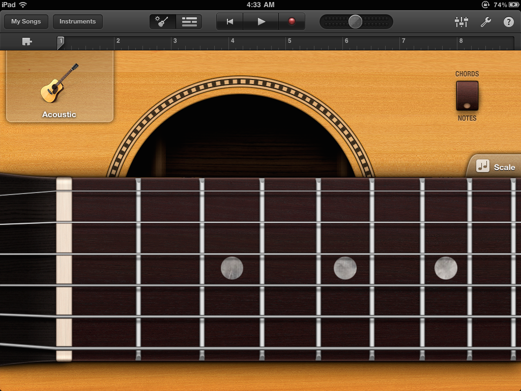
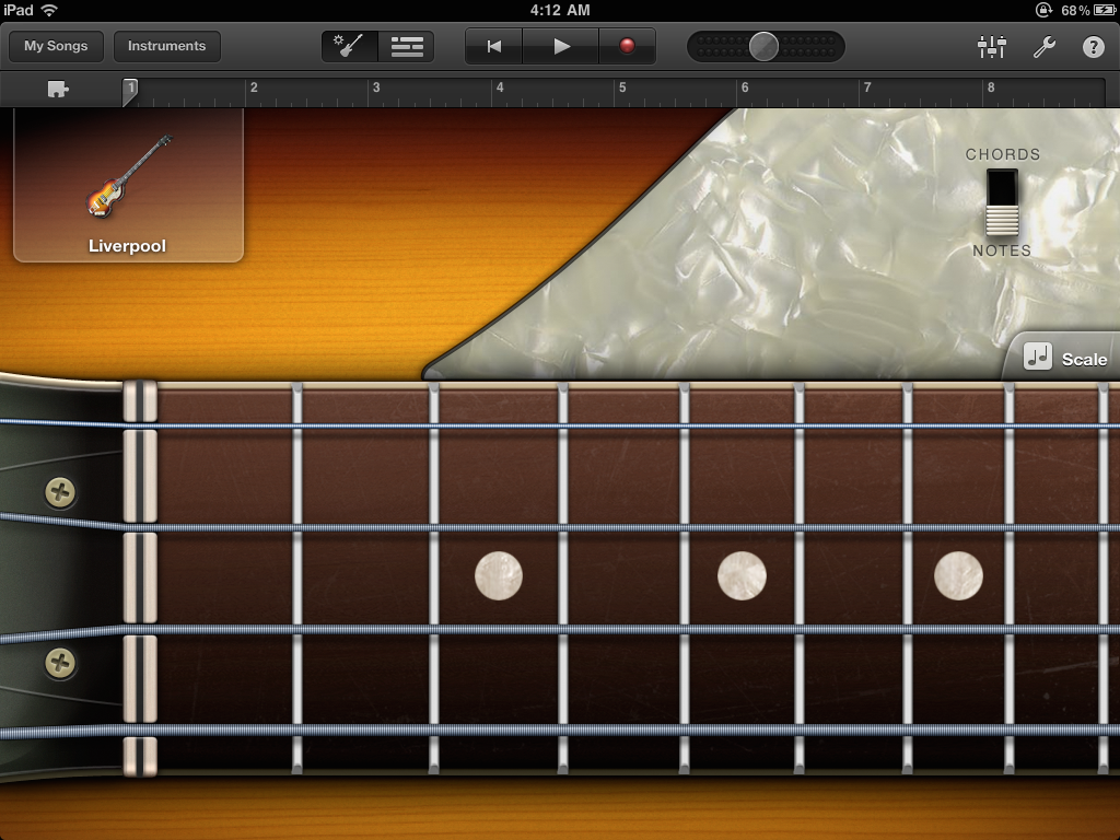
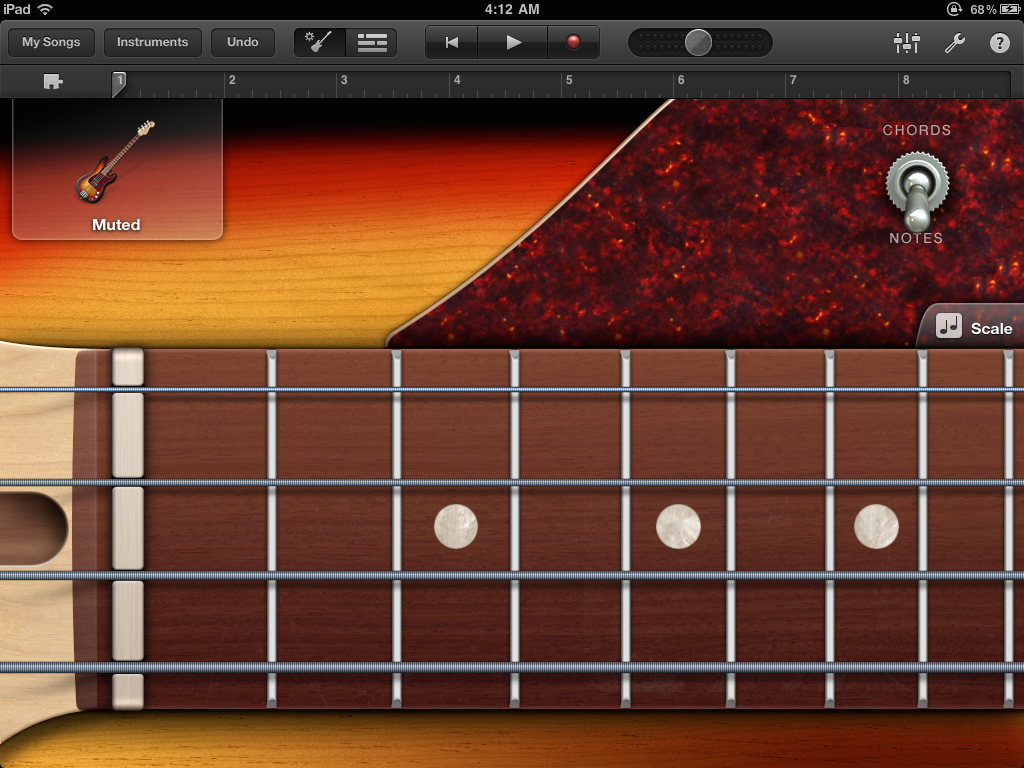
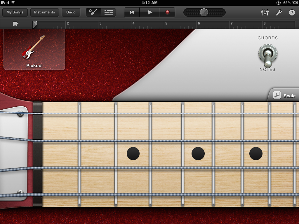
Smart Guitar, Notes view.
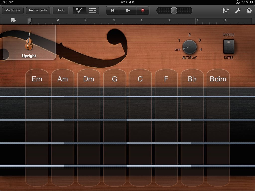
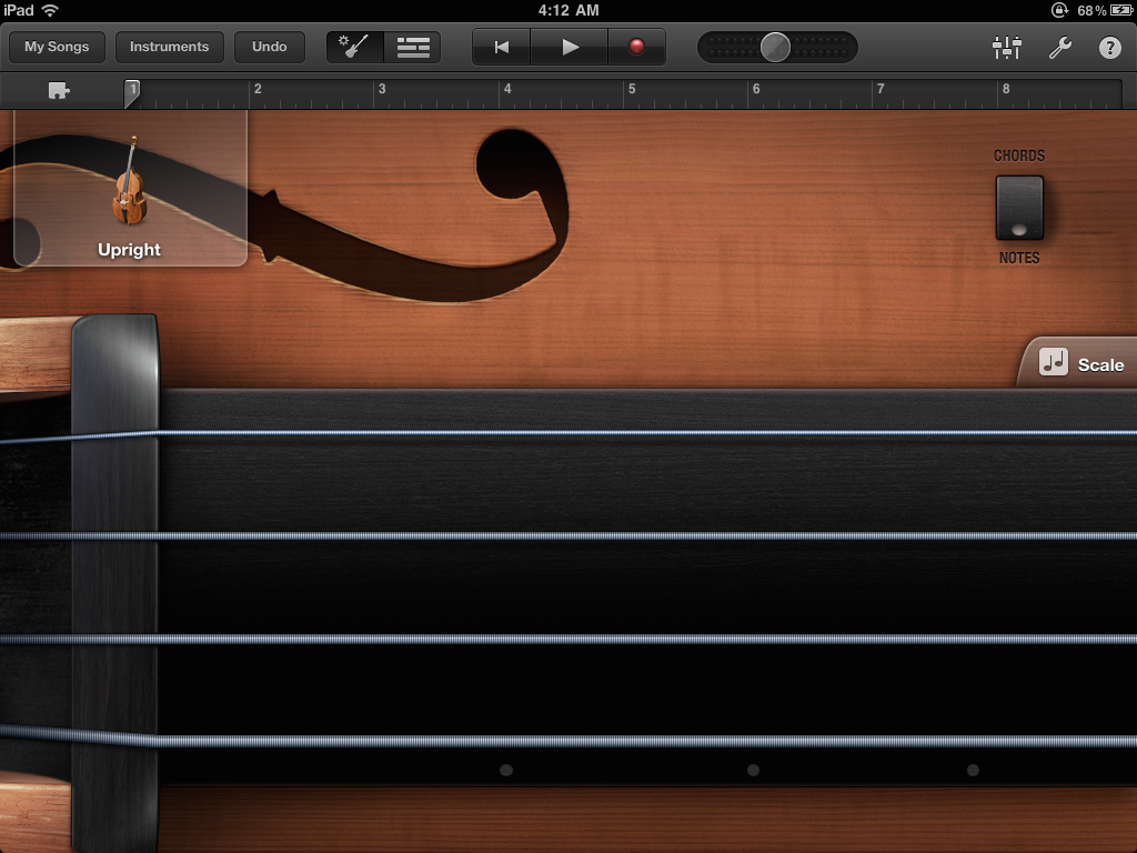
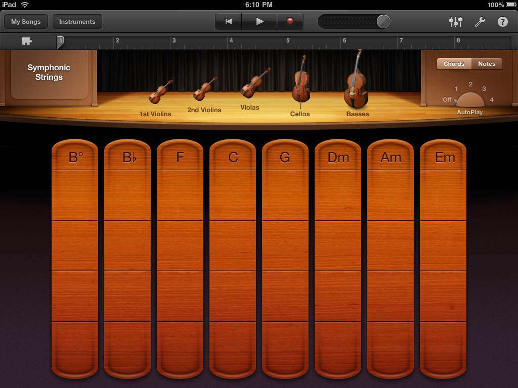
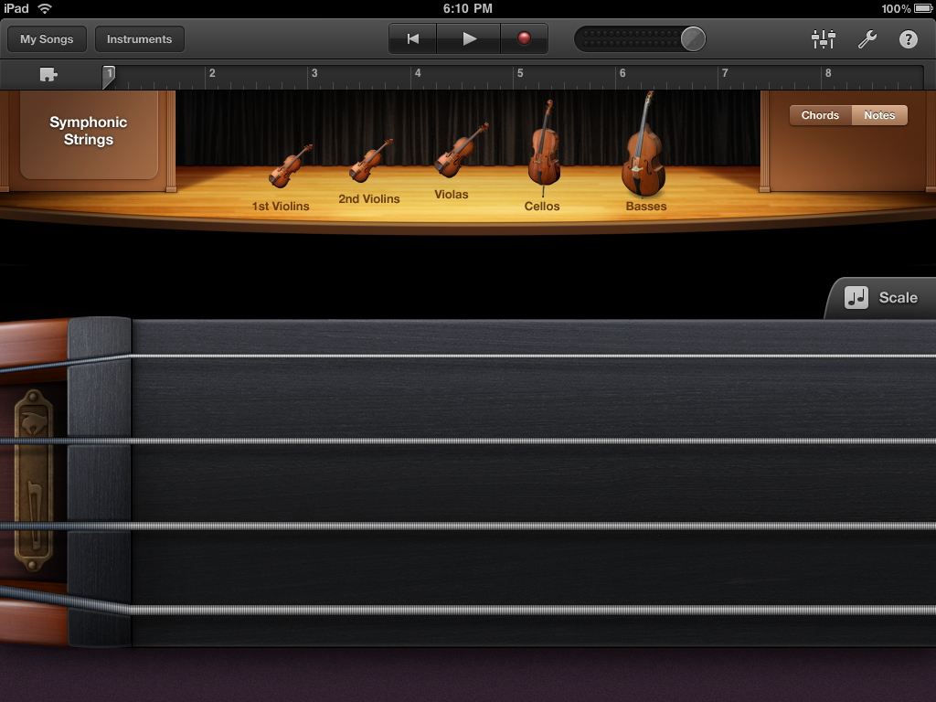
Smart Strings.
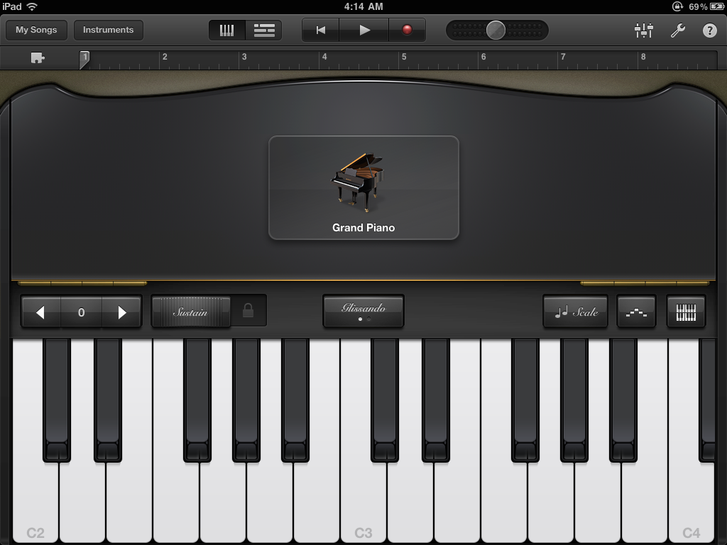
Keyboard.
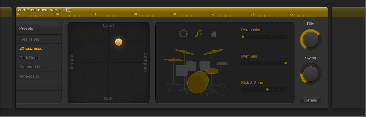
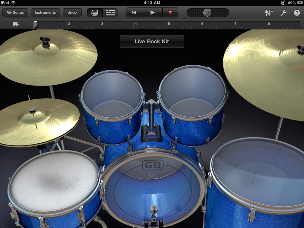
Drum Kit.
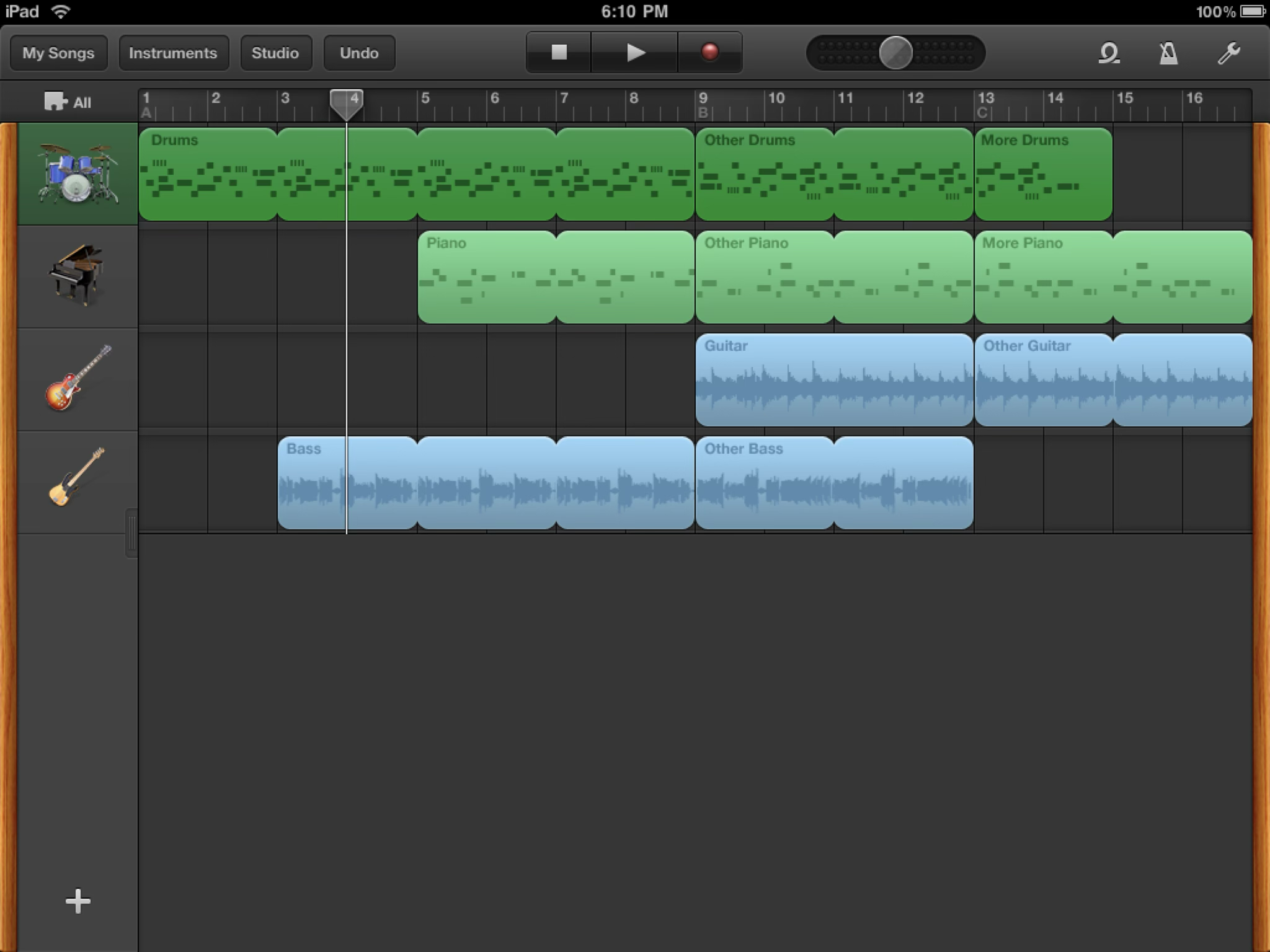
Track editor.
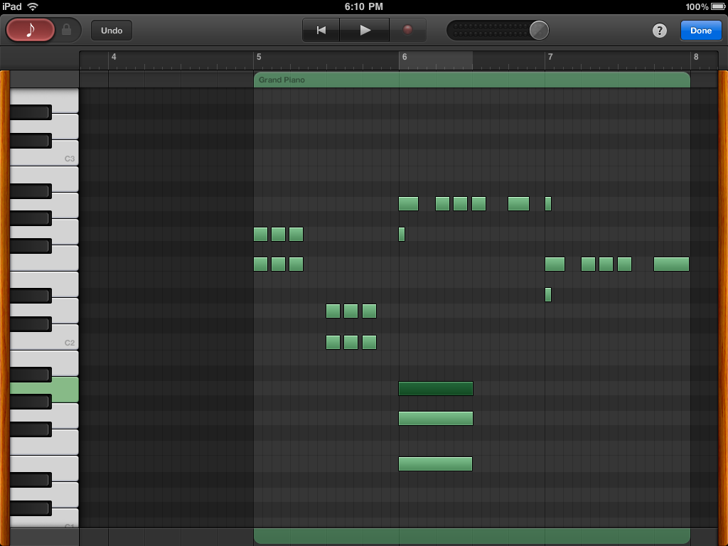
Region editor.
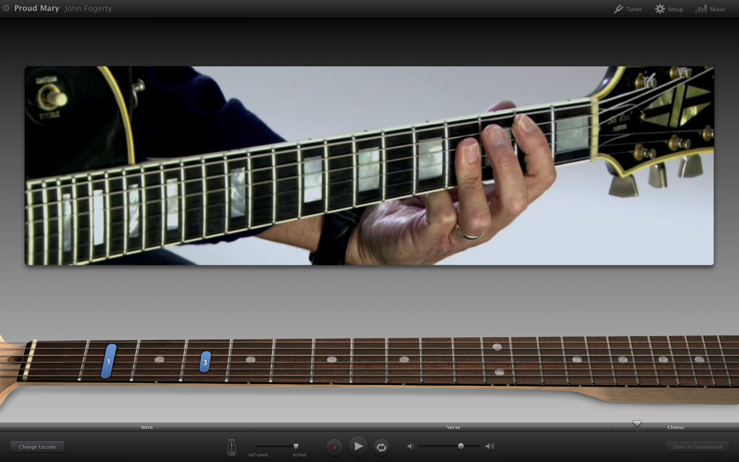
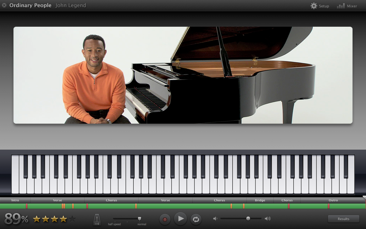
Learn to Play is a cool feature where famous musicians teach users how to play one of their songs, with lessons for both guitar and piano.
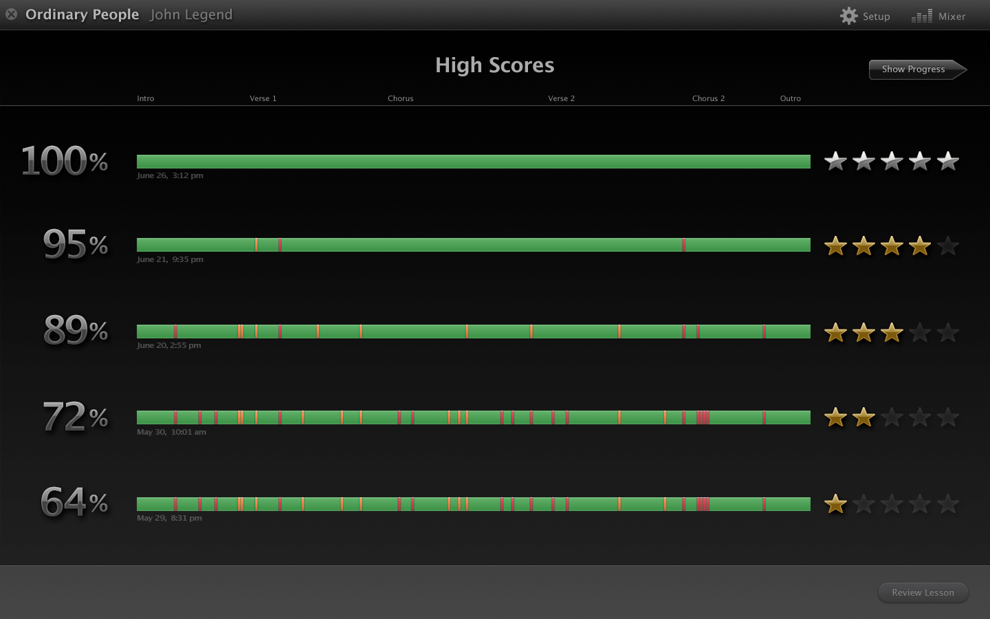
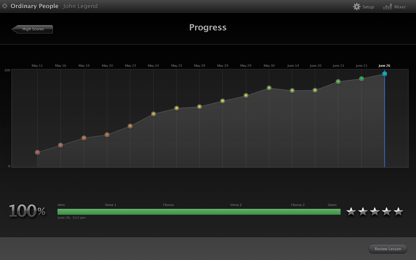
Overlays help identify the keyboard keys or guitar chords along the way, and the user’s attempt is graded as they go. Each attempt is charted so users can see their progress as they improve.
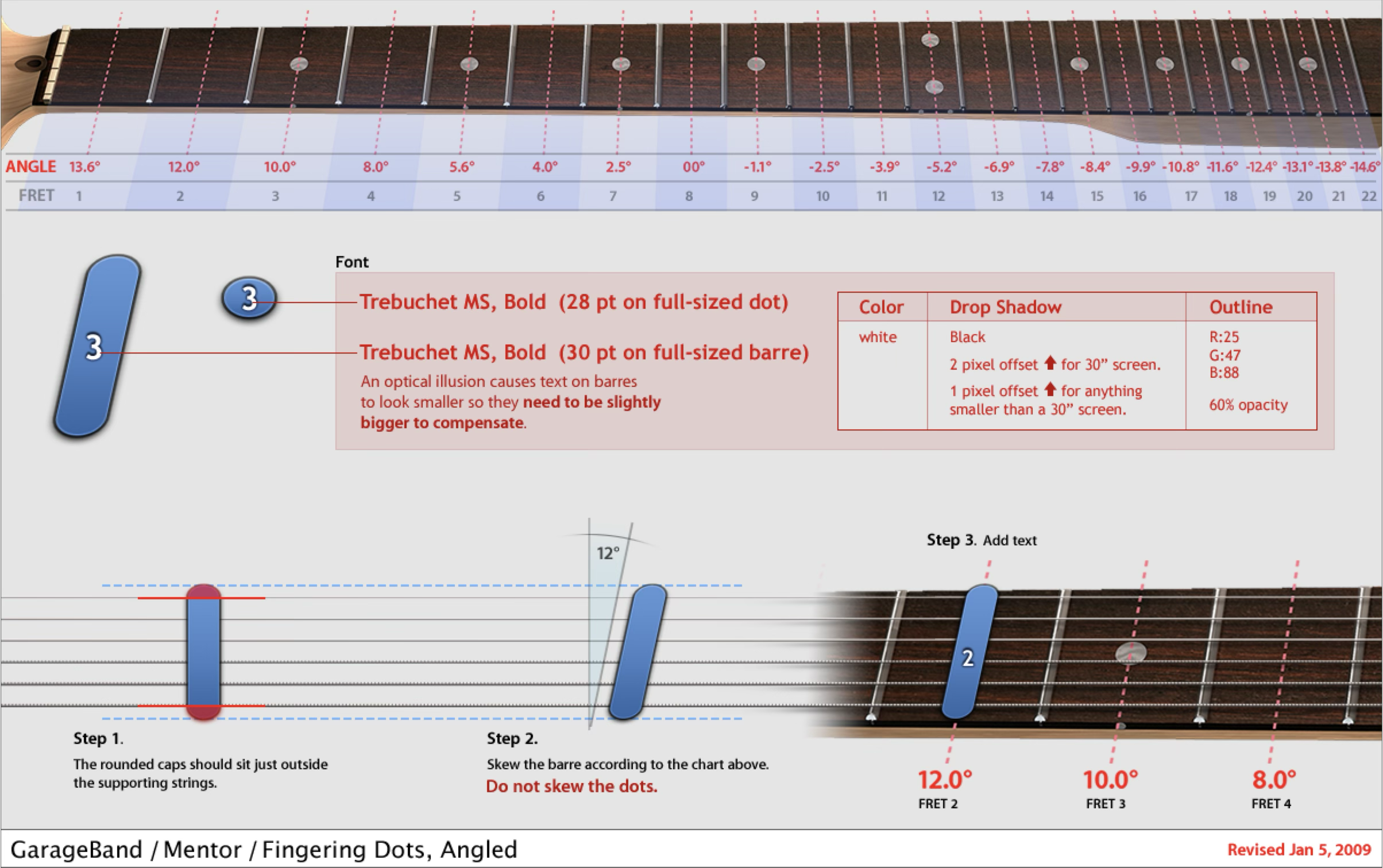
Closeup of the fingering showing how much of each string should be pressed down.
Spec for Engineering.
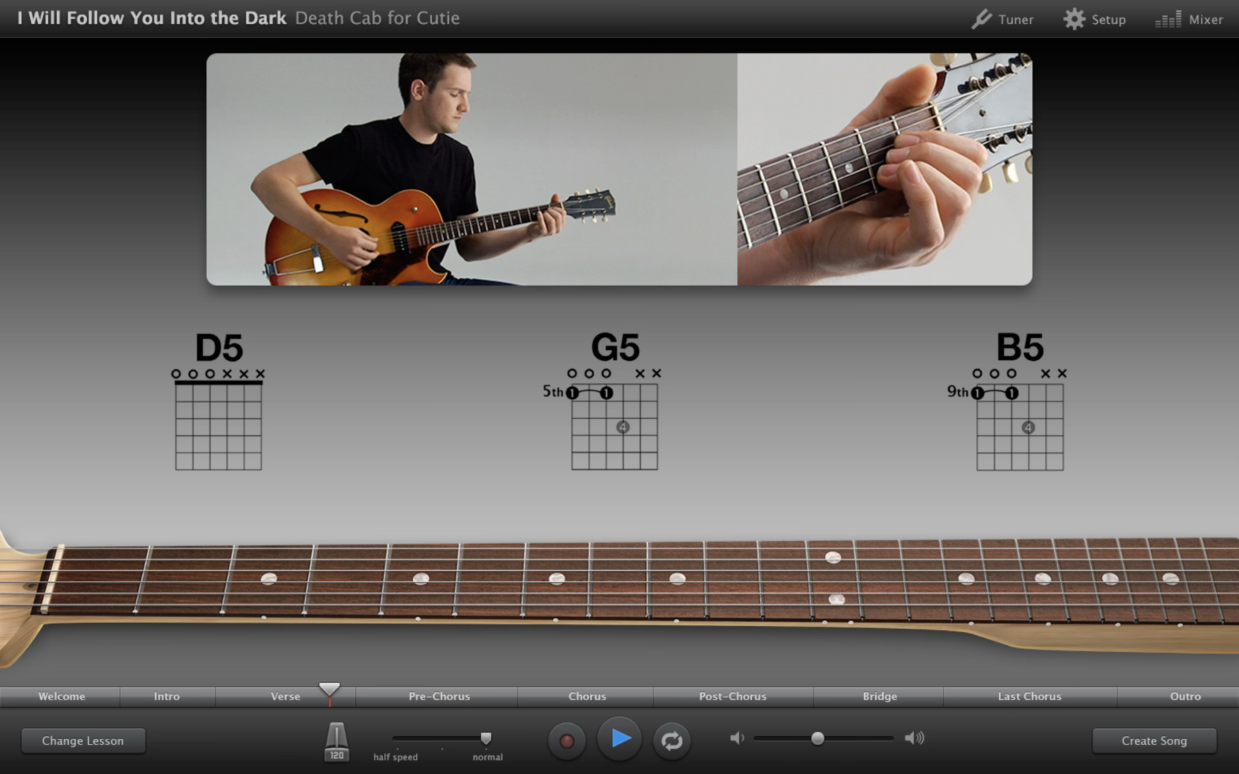
Demonstrating the chords for this song.
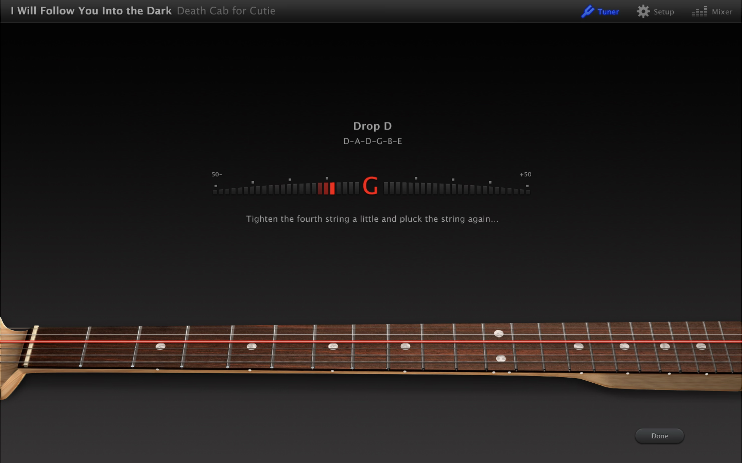
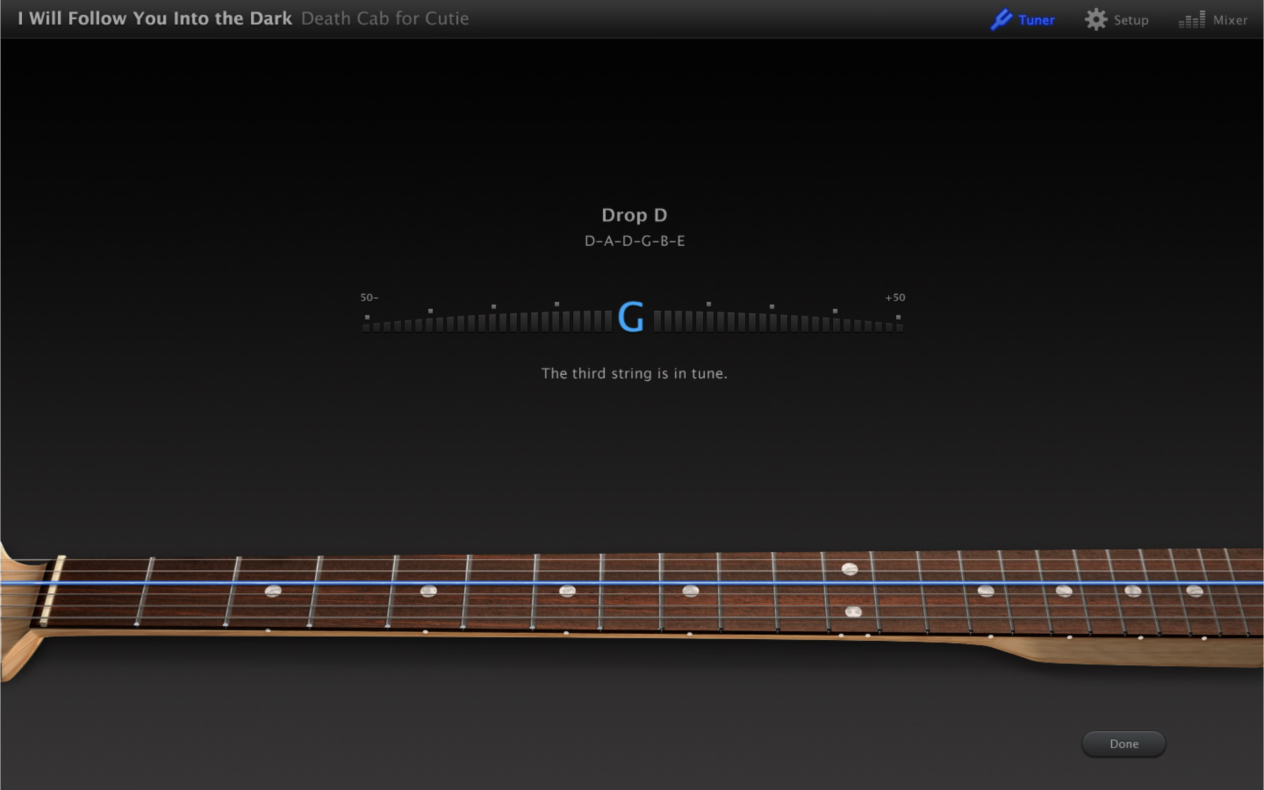
Guitar tuner.
Guitar tuner.
Tracking the user’s mistakes and successes as they play along.
After leaving Apple I came back as a contractor to work with one of my favorite Engineering teams. They were preparing to add the first set of international instruments to GarageBand for iOS.
In a nod to the growing Chinese user base, these new instruments were the Erhu, the Pipa, and a set of Classical Chinese percussion instruments. All visuals and materials were painstakingly researched and vetted with Chinese musicians and Chinese musical experts for maximum authenticity.
Everything in this scene was part of a 3D model.
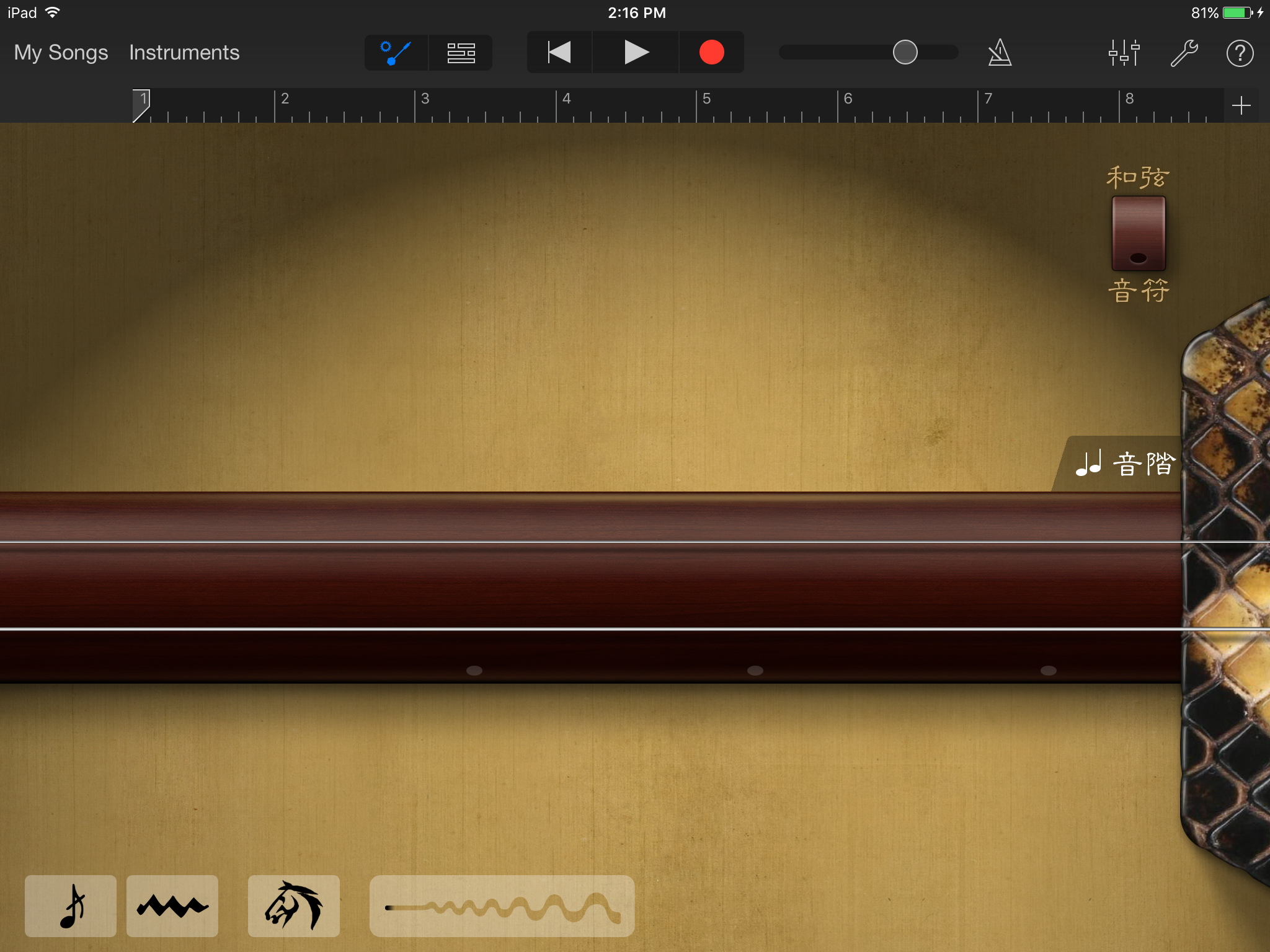
The Pipa. Grandmother of all stringed, guitar-like instruments. Traditionally played by women and passed down to daughters and granddaughters as precious family heirlooms. Our Pipa performer/consultant and I took great care to give ours the right color, age, and wear to resemble what we envisioned as “your Grandmother’s Pipa.”
The Pipa in Chords View.
The Pipa in Notes View.
The Pipa needed a background that spoke to its strong association with Springtime. There are many famous Pipa songs about fresh bamboo, singing birds, and the resurgence of new life. When I couldn’t find the right silk design, I created my own from scratch. The green silk fabric is composed of several dozen layers in Photoshop. The pattern comes from two sketches I did of a swallow and cherry blossoms, both symbols of Spring.
The Erhu. Traditionally played by men. Has a beautifully mournful sound.
The Erhu in Chords View. Chinese language version. For the background we went with aged and yellowing silk. In Chinese culture yellow is associated with the moon, and the moon and moonlit scenery is a common theme in Erhu songs. The shabbiness of the silk is a nod to the Erhu’s historic connection with street performers.
The Erhu in Notes View. Chinese language version.
After completing the Chinese instruments, I came back once again to work on a set of Taiko drums for GarageBand for iOS. These drums hold a revered and special place in Japanese culture. Great attention was given to the modeling and texture of each individual item in the ensemble.
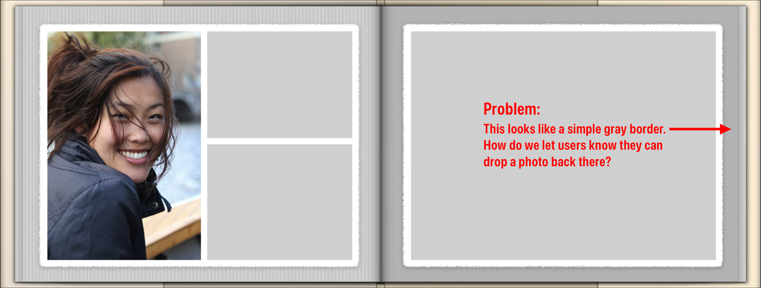
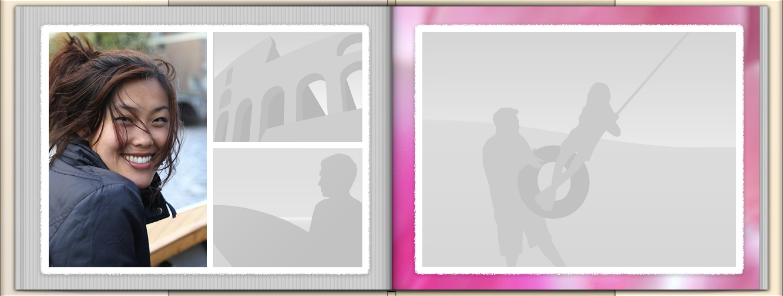
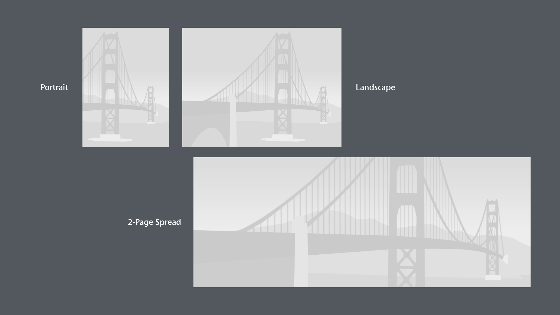
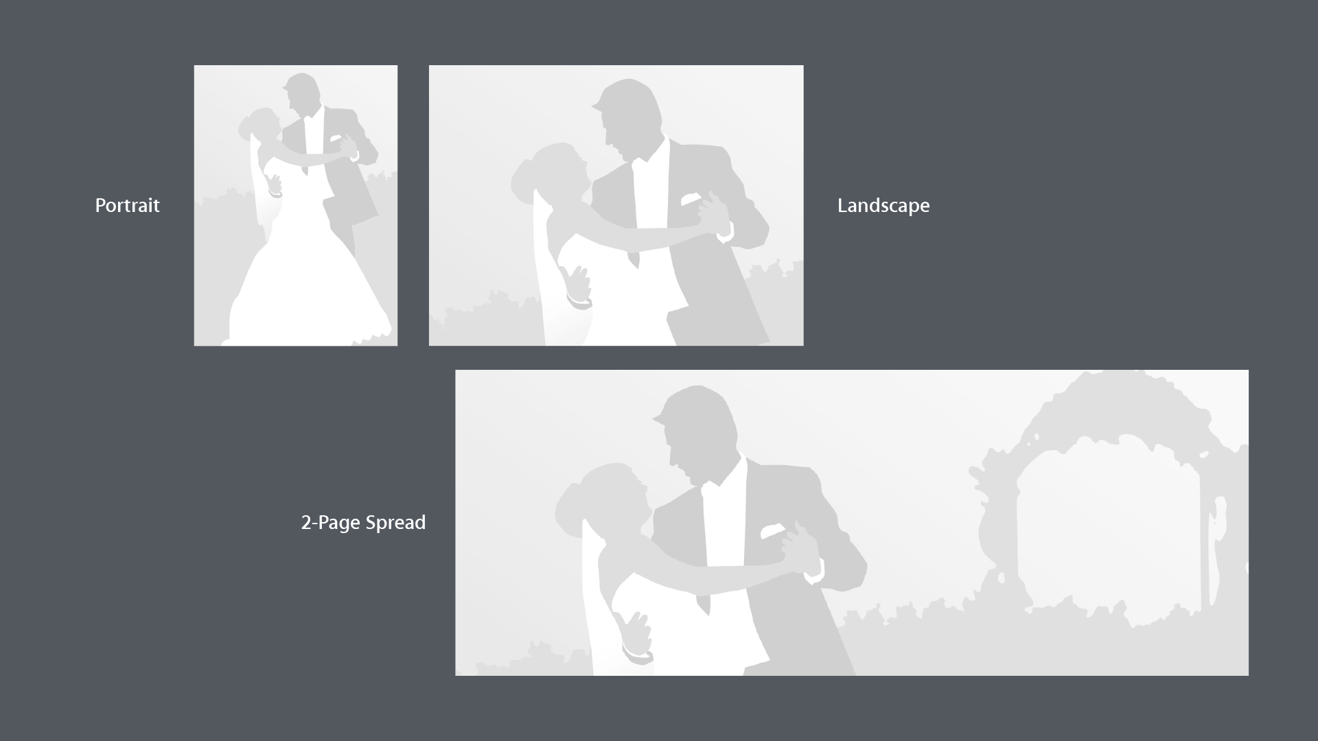
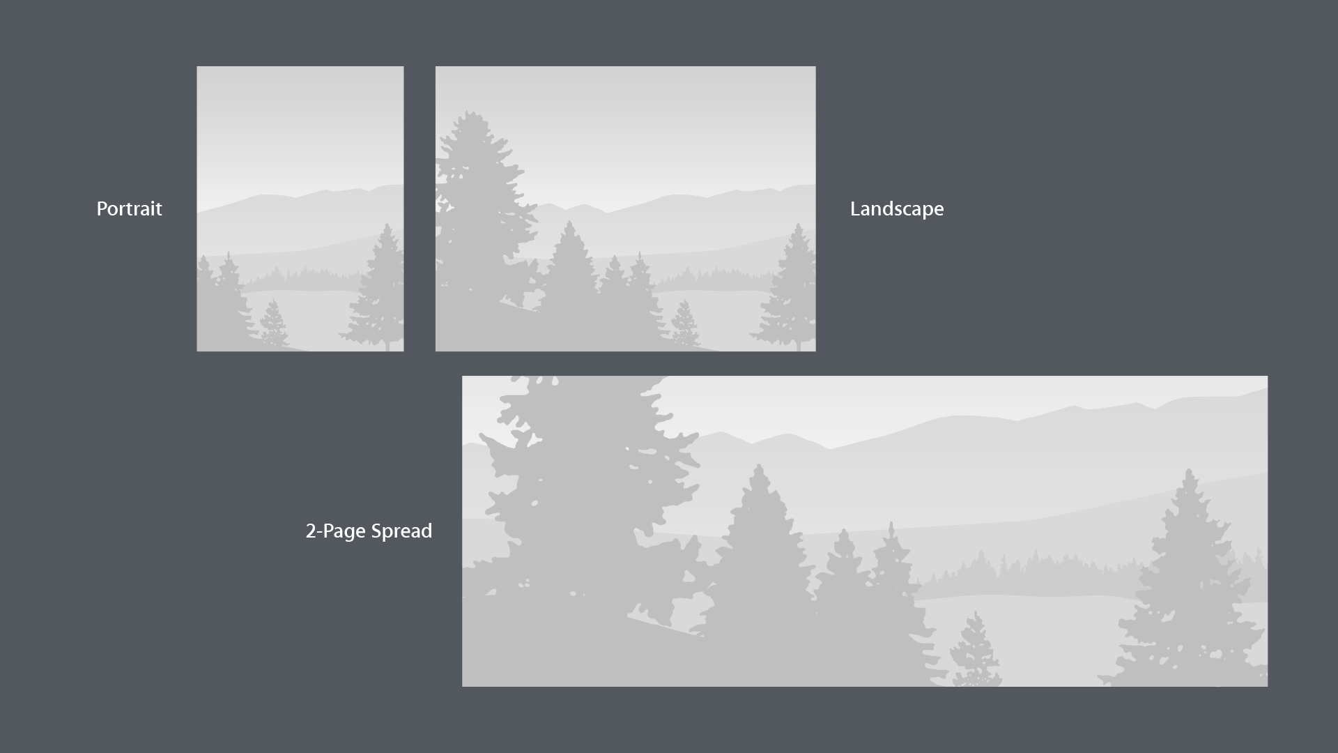
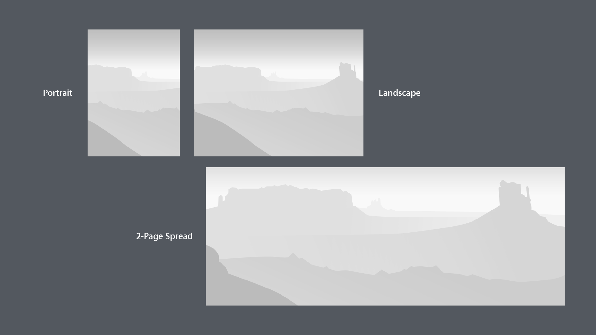
One of the most interesting challenges for me in iPhoto was the issue of how to make drop zones more obvious. Where could users “drop” their photos, and in some cases, what would happen when they did?
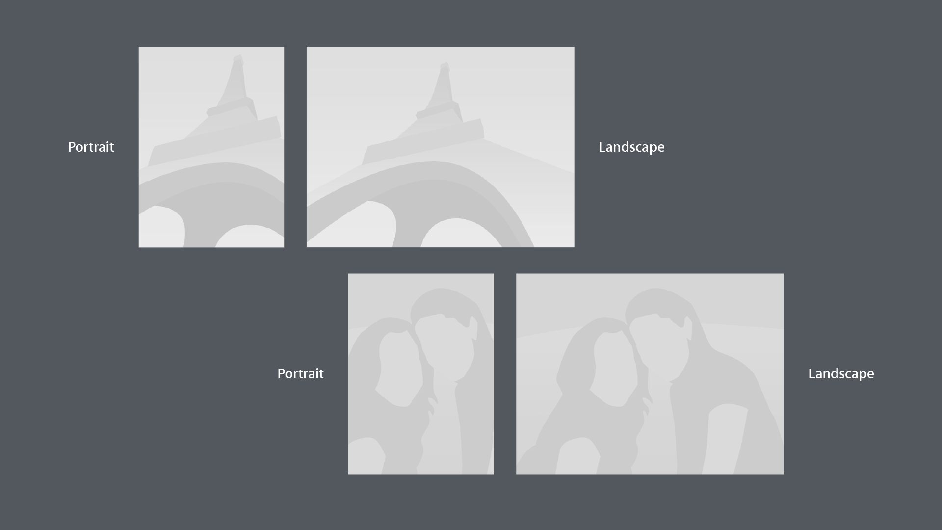
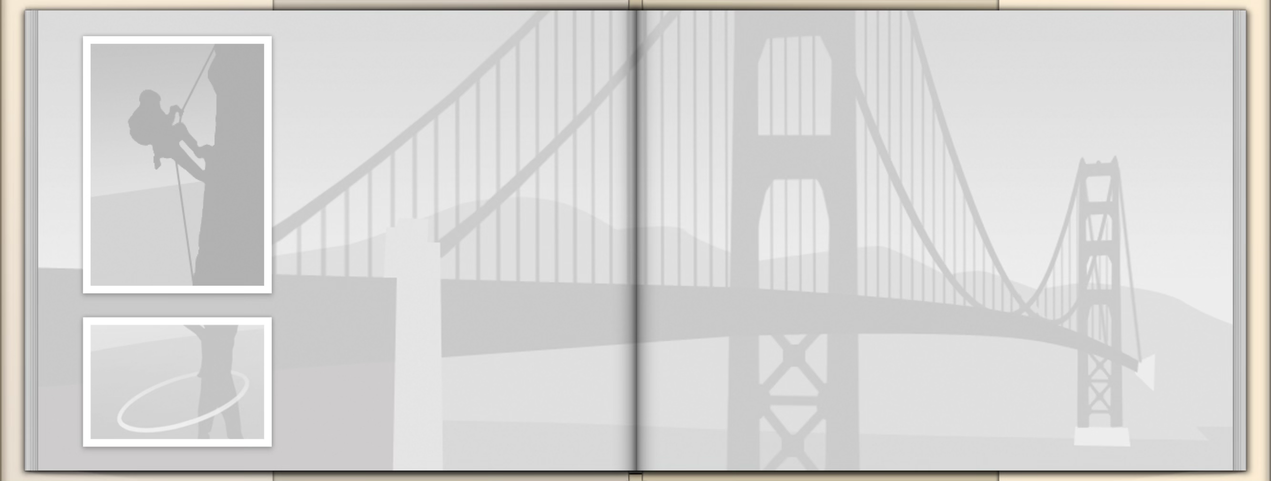
The solution I came up with was placeholder images: simplified, grayscale representations of photos.
The imagery needed to be recognizable, but not too busy. Additionally, they each needed multiple versions, such as tall, wide, and 2-page spread, to work with all the different photo book templates.
In the end, I kept the scale of grays tightly limited across a narrow range, with a subtle, sparing use of gradients.
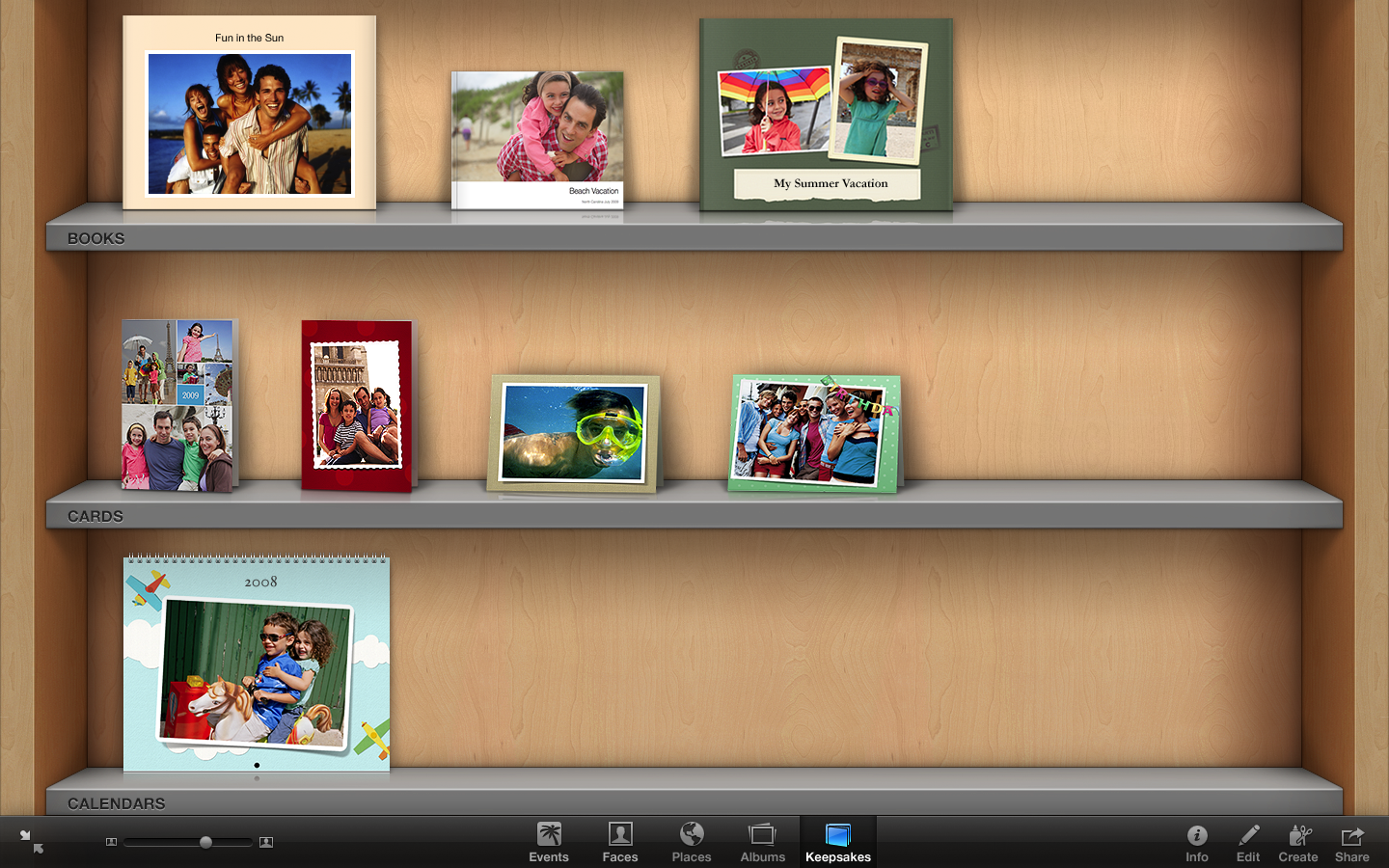
The shelf in iPhoto for user-created books, cards, and calendars.
Subtle, grayscale images provide just enough of a hint.
The user’s fun, photographic border.
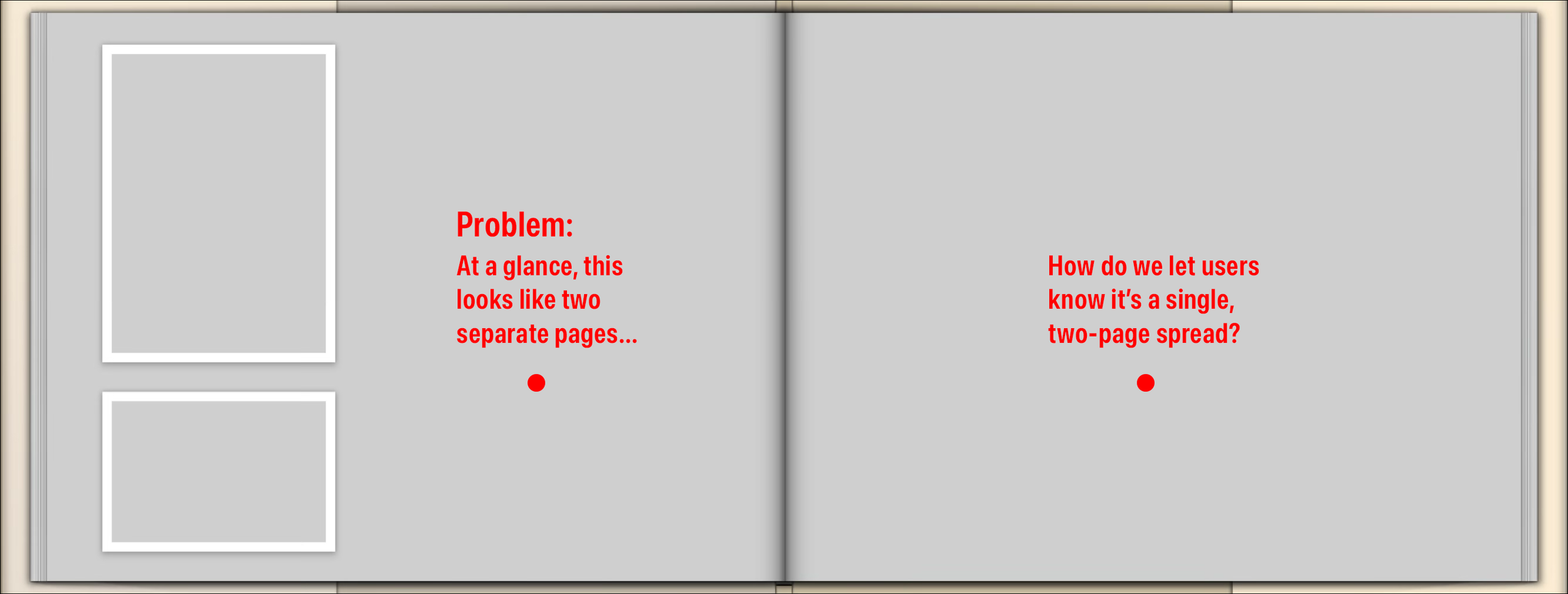
“Will this give me two photos facing each other on separate pages, or will it spread one photo across two pages?” Ambiguity wastes time.
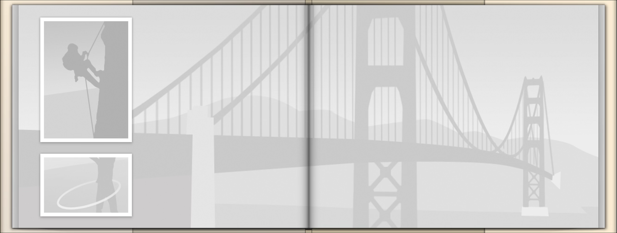
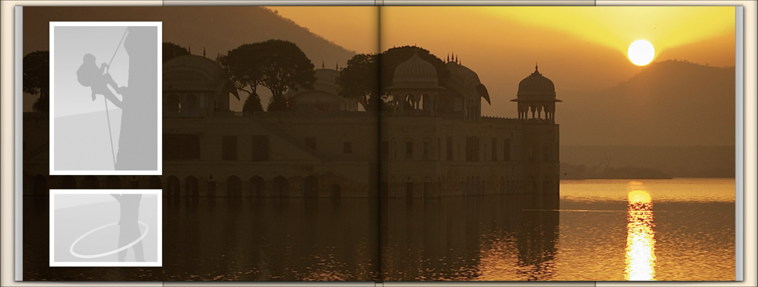
Now it’s clear what the user can expect.
The user’s photo spread.
Sample placeholders.
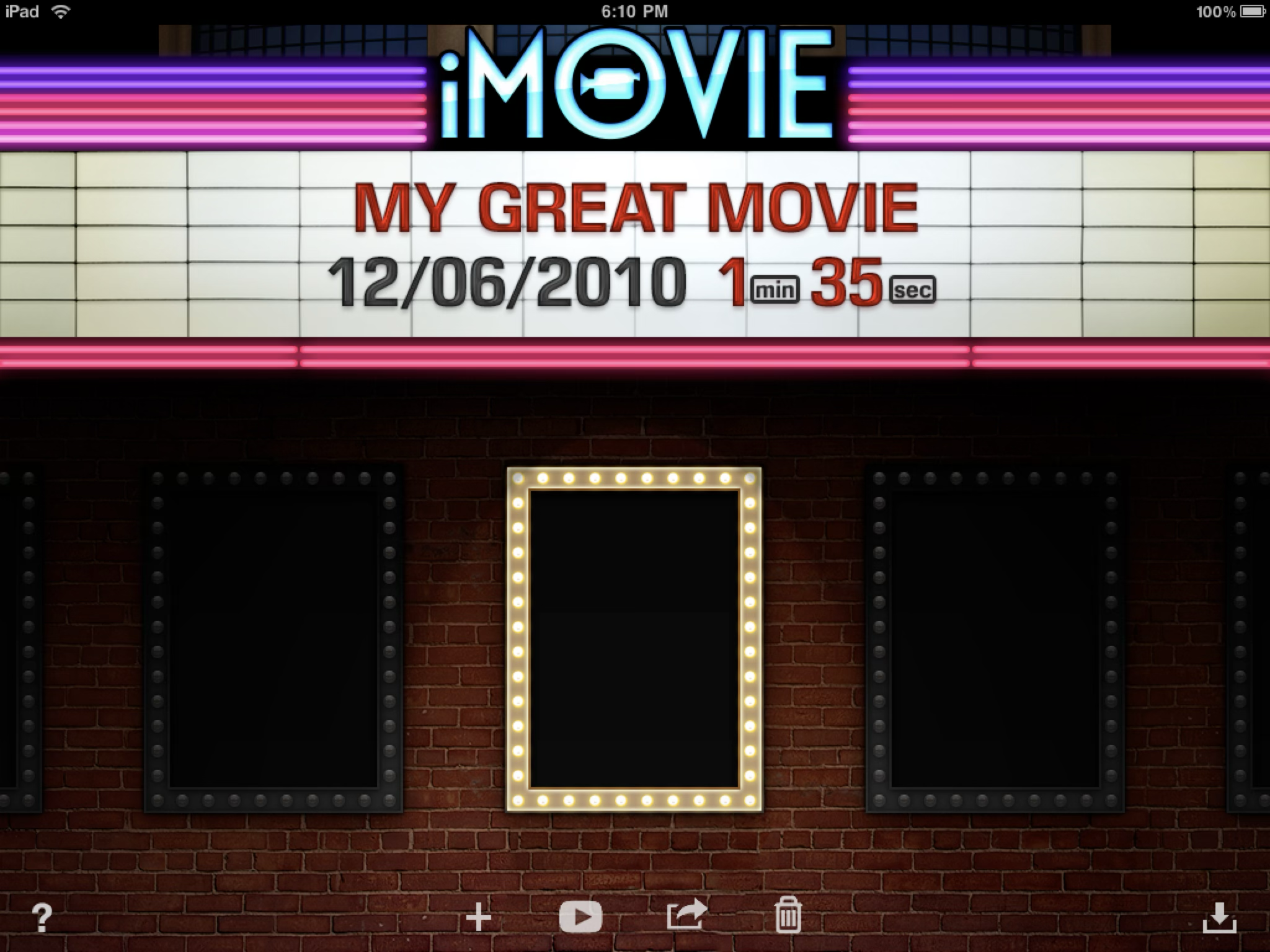
The first version of iMovie on the iPad had a physical marquee and theatrical seating.
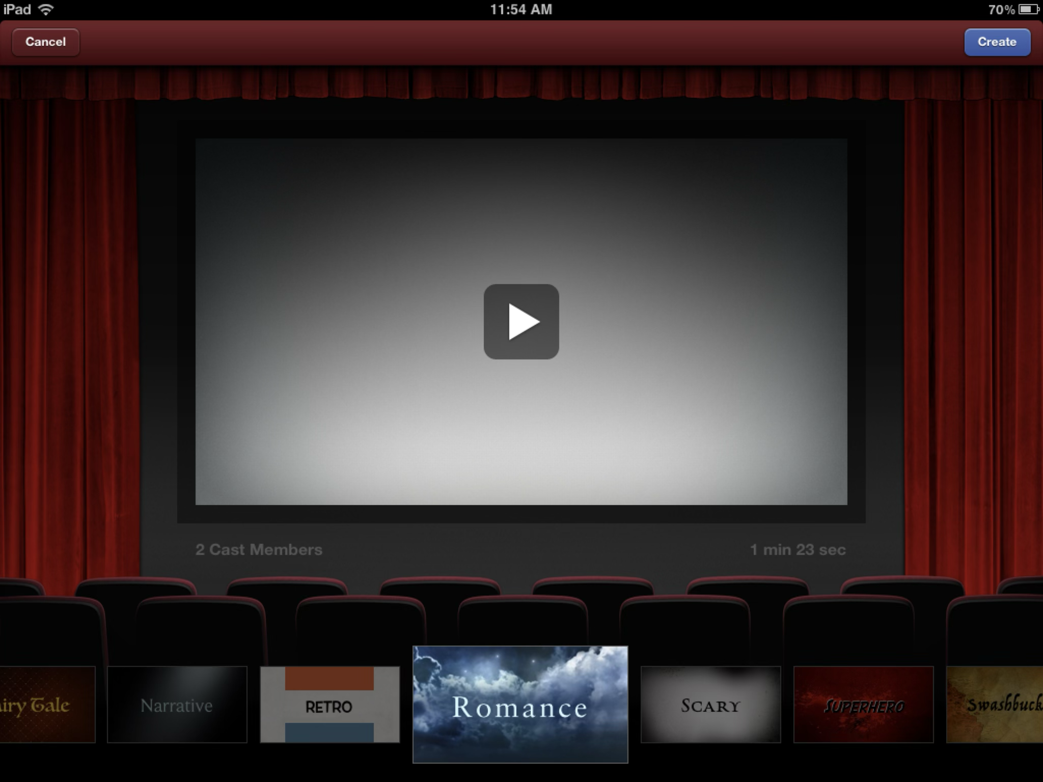
A new feature called Trailers let users create Hollywood-style montages by dropping their own photos and video clips into pre-made templates. The app automatically applied built-in musical scores, dynamic transitions, and animated text.
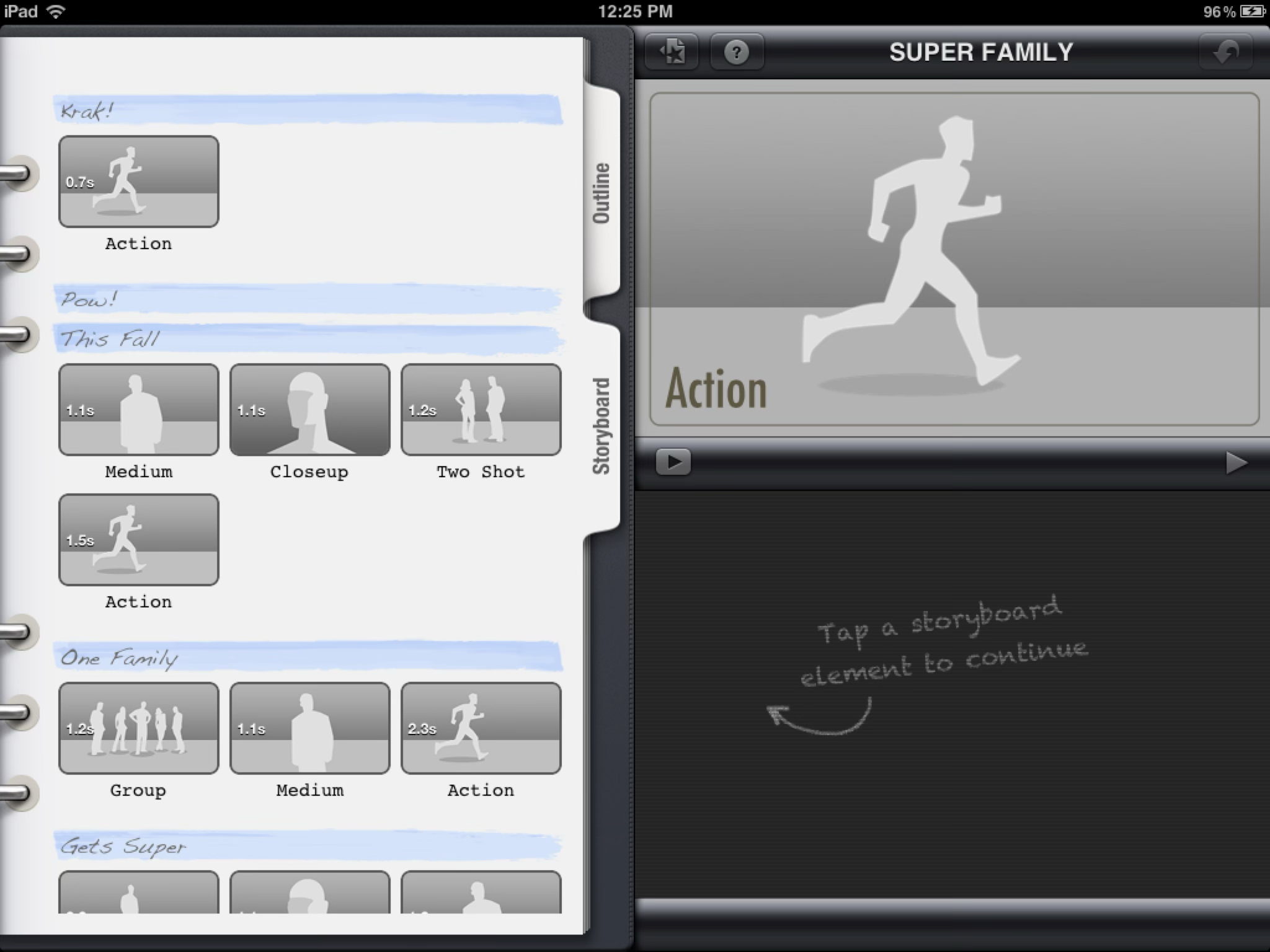
I created the binder-themed UI to feel official, like something in the hands of an Assistant Director. It contained the customizable script and the storyboards.
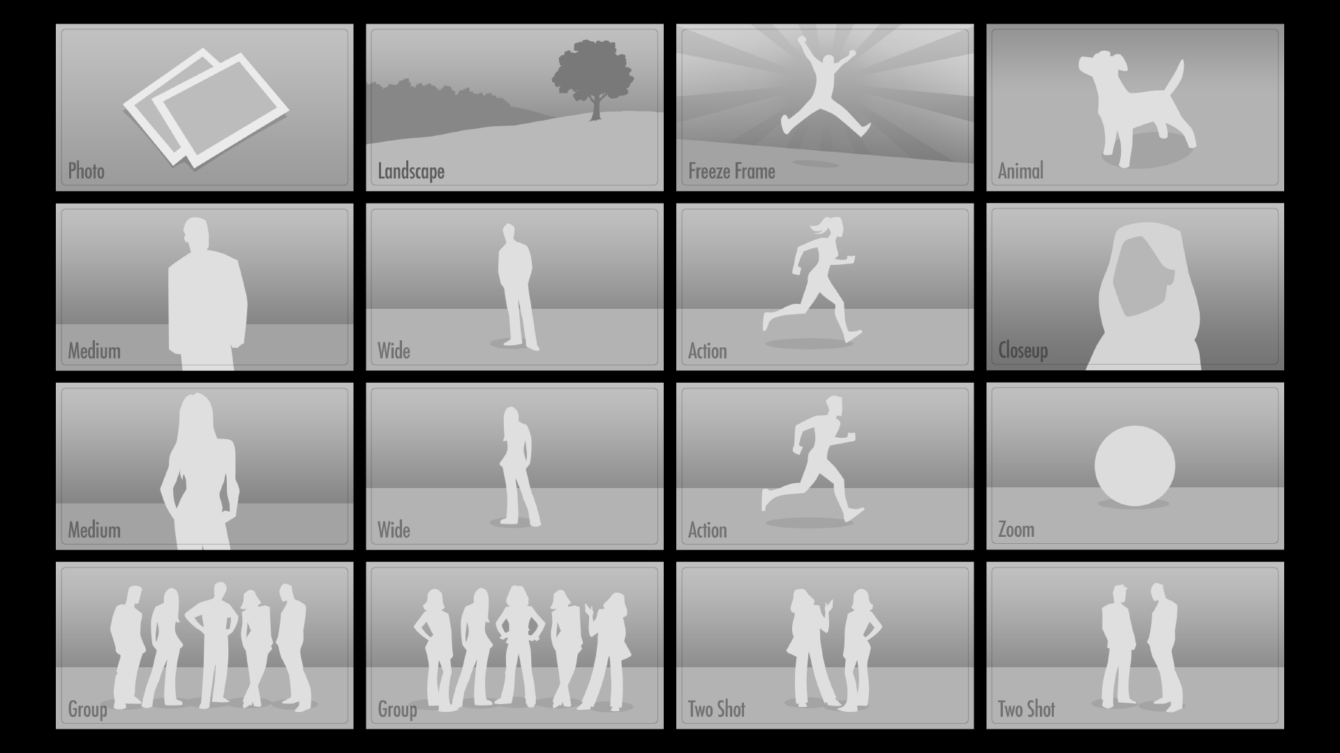
The storyboard images told users what kind of footage they needed to shoot. The storyboards were eventually adopted into the main iMovie desktop interface as animatics.
The original iPad version of the app presented itself as a full-on movie marquee.
The rings and tabs gave this screen a serious and professional feeling, like the Assistant Director’s production binder.
Various storyboard images. Eventually these were adopted into the desktop version of iMovie as moving animatics.
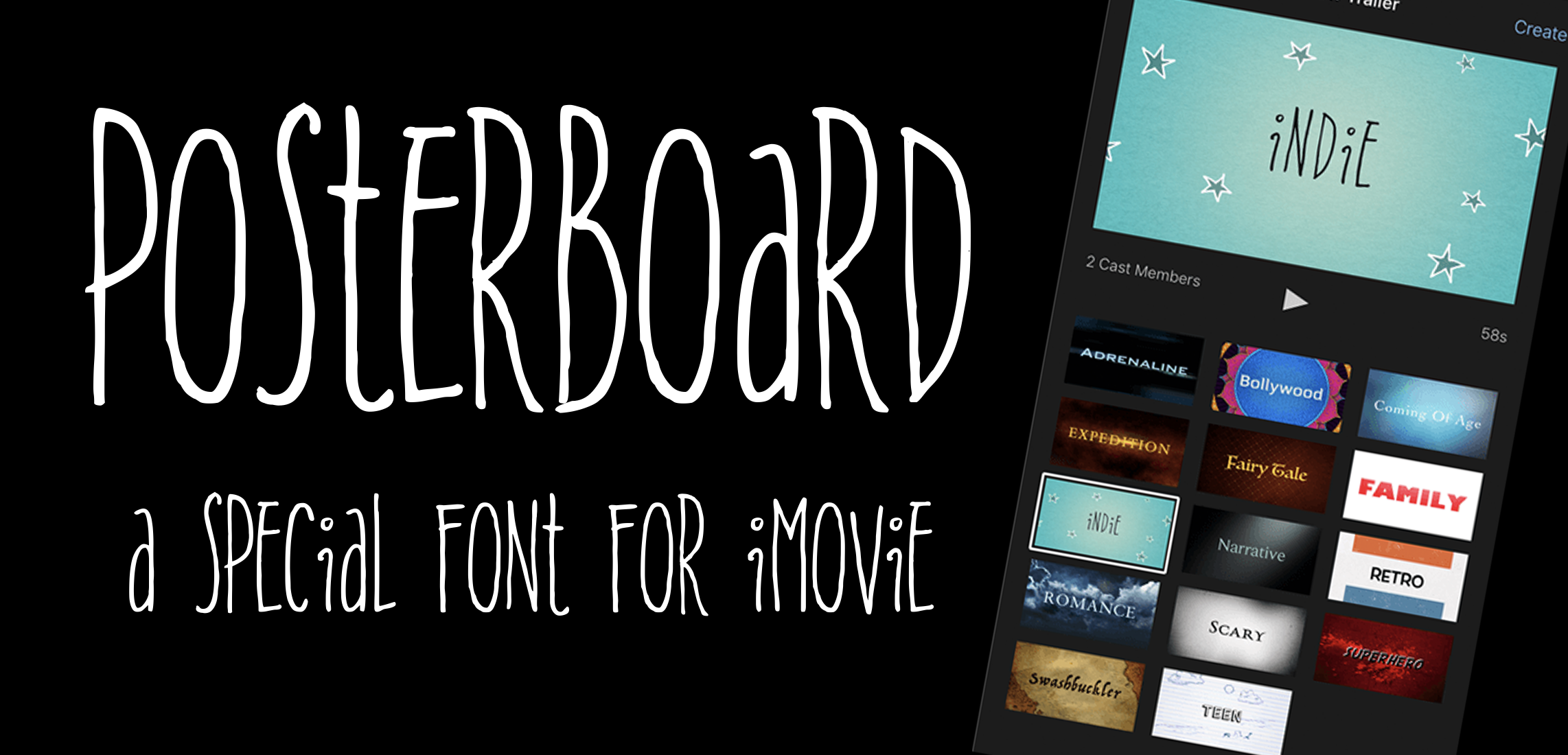
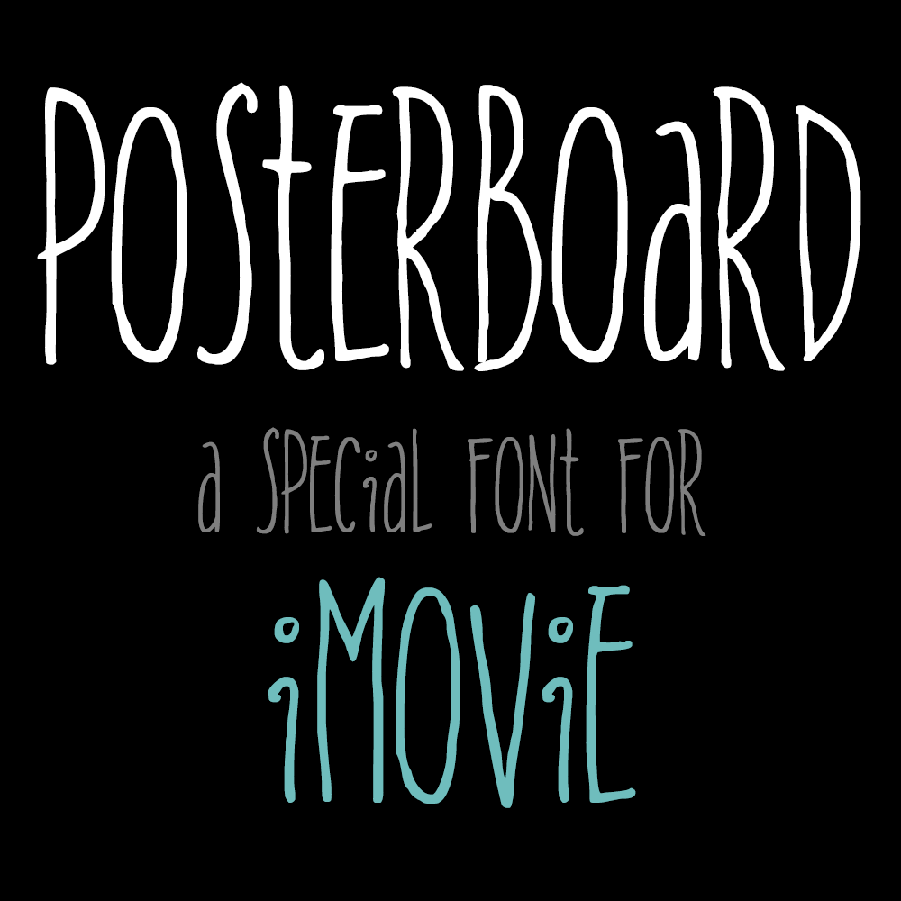
I once had the unique experience of providing the hand-drawn letterforms for a new font to be used in iMovie.
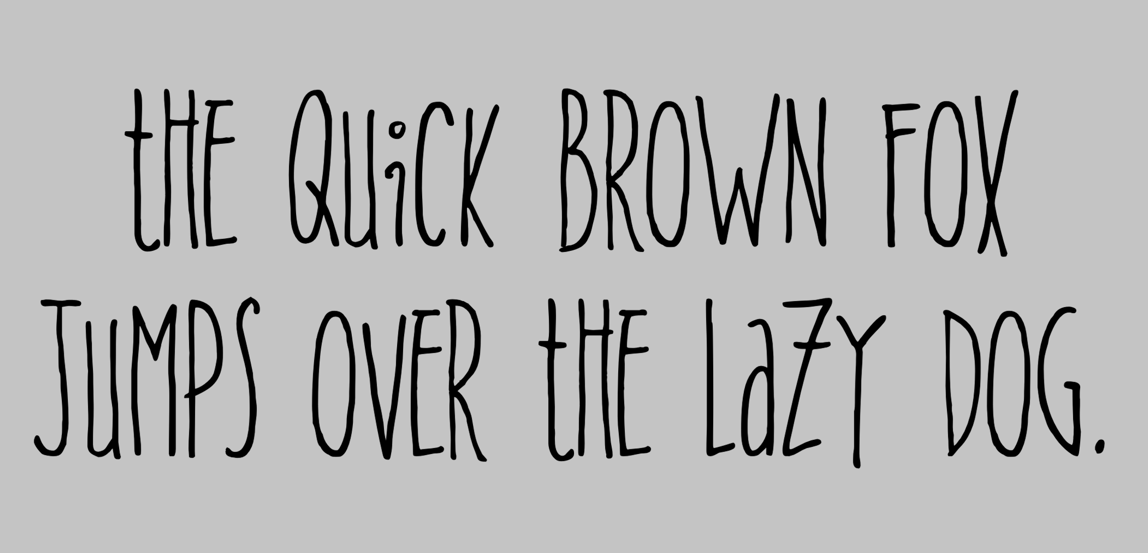
It was supposed to be quirky, artistic, and a little kooky. It had a mix of capital letters with a smattering of lowercase thrown in. There was no capital “A” or capital “I,” for example.
Working closely with a font expert, I generated a basic alphabet, then we drilled down on specific characters. I might generate 30 versions of one letter before we were satisfied, or another might only require five or six iterations.
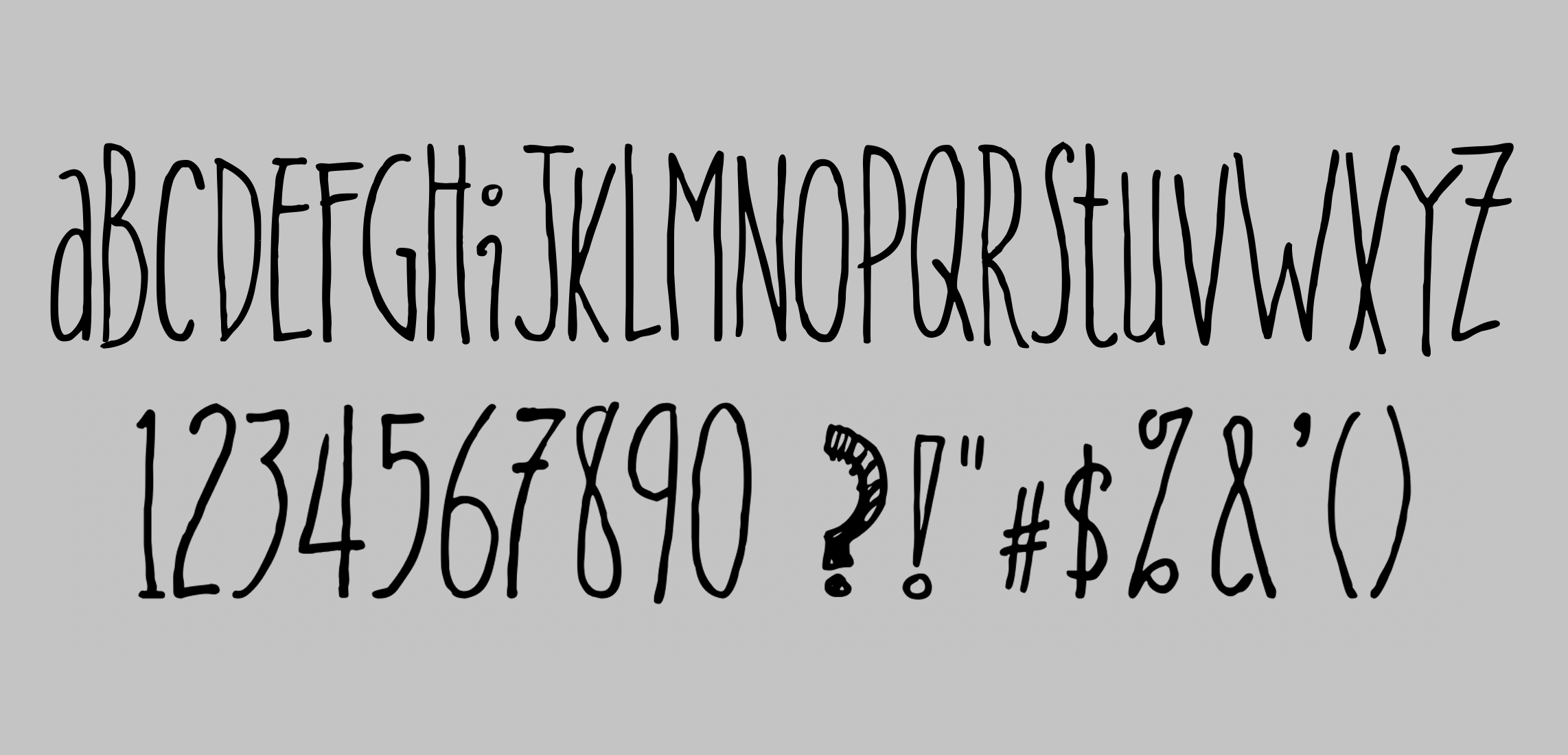
After the letterforms, we did numbers, punctuation, diacritical marks, mathematical symbols… Greek symbols!
We. Did. Everything. And we talked about each one, debating its place in the group. Some seemed to be wild cards (like the question mark). It was an enormous amount of work, and I loved it!
When we finished, I got to name the font. My inspiration had been teenagers drawing posters for a high school event. So I named it “Posterboard.”
Posterboard was the font used for the Indie trailer.
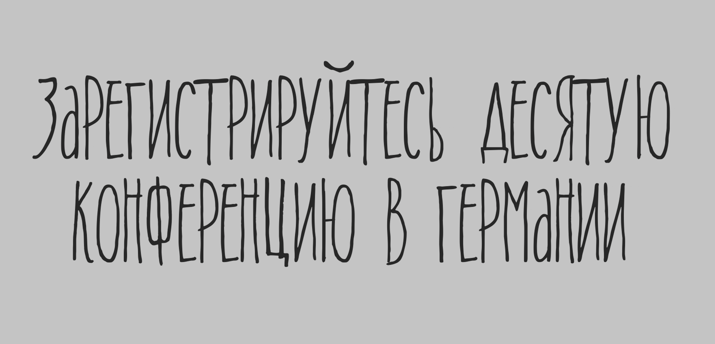
I even got to do Cyrillic characters!
In 2017 Facebook released a major update to their old, outdated set of emoji. The new set brought everything in line with the latest Unicode standard, including support for Fitzpatrick Scale skin tone variants. I provided all of the people and body parts, as well as many of the animals.
In 2018 Facebook released a massive update to their previous emoji update. The new version added more depth and detail throughout, an ambitious undertaking in a relatively short amount of time.